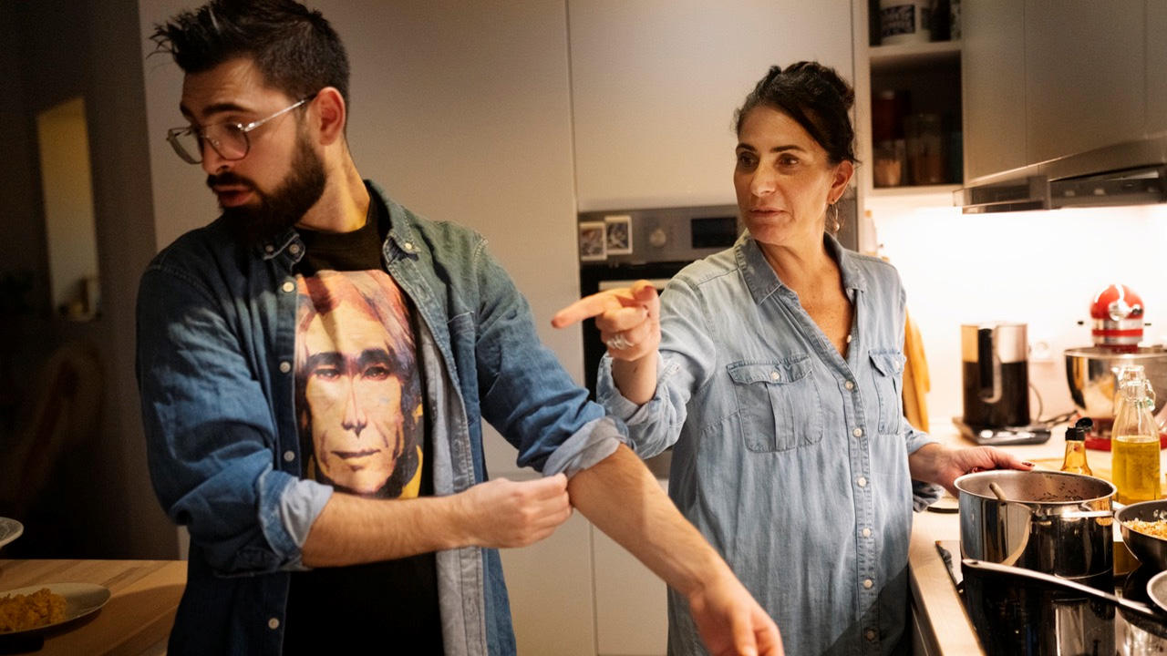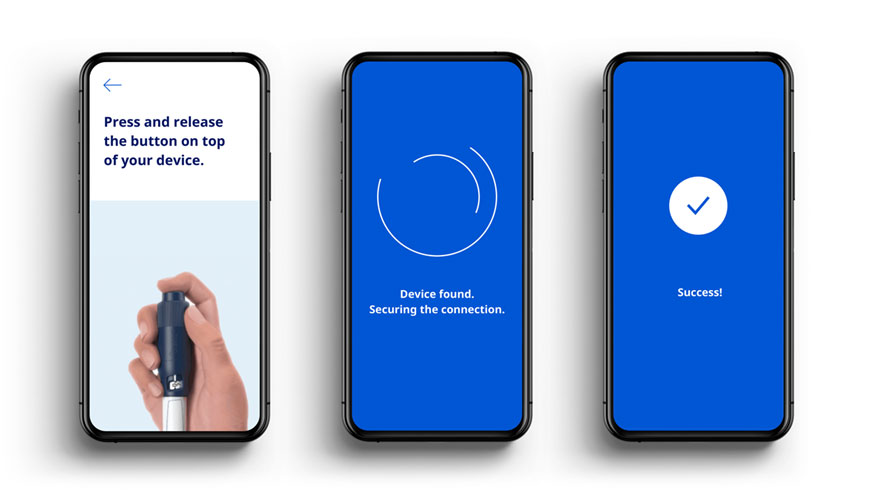


- Keep imagery real and grounded in authenticity, similar to reportage photography.
- Keep a simple composition.
- Endorse simple geometry, symmetry and visual balance.
- Use natural light, saturation and contrast in the photos.
- Our imagery selection should cater for different geographies, for identification purposes.
- Ensure readability if you place text on top of imagery or video.
- For AI-generated or partially generated photos, it is mandatory to follow the relevant guidelines: AI Communication guidelines
- Do not use b/w photography (unless it serves a historical purpose).
- Never use coloured filters (or any other filters) on top of imagery and footage.
- Never place a coloured overlay on imagery and footage.
- Be respectful: Don’t place text or graphic elements on top of people’s faces.
- Product brands, clinical trials and corporate areas are not allowed to use each other’s photos.
- All photos should have a caption (exceptions: small formats such as thumbnails, social media posts etc. and websites due to responsiveness).
- Use photo captions for signature images to accentuate the element of authenticity.
- For patients, write full name and disease type.
- For employees write full name and title.
- Feel free to add country.
- Place in any four corners and use either True Blue or white. Either next to the image frame or inside it.
- For photo mosaics write one caption covering all photos.
- The caption should always be visible and readable.
We crop for a distinct expression, for focus and for simplicity in composition. Crop images until no superfluous visual information is left. Letterbox, square, rectangular; any ratio will do.
